With the desire to create a unique and authentic design identity while preserving Momax’s diversified core business. A design philosophy was born to create a flexible and agile design system that’s still recognizable through unique Hong Kong’s identity.
Momax Design System, 2023
Industrial Design Lead / Design Language Direction
Traditionally a blue-label trading business, Momax as a major regional player in Hong Kong saw an opportunity to expand its global presence and with it, the need for a more cohesive and recognizable design identity arose. I was initially brought in as a senior industrial designer to strengthen its core design identity that was slowly being built up with the Shenzhen-based design team. The direction back then was based on replicating the aesthetic of a successful brand like Apple with a repeatable design detail that would allow Momax to be recognized with a cohesive look and feel. I quickly recognized that without utilizing an understanding of what the consumer inheritably values from the brand and products as a foundation for design and product strategy the potential success of the brand would be limited. With that realization, I, informed by the new product strategy from the Lab director, conceived the new design philosophy with the user’s needs and values at the core.
Momax design language version 1.0 which was initially created to better unify Momax products with emphasis on uniformity and heightened quality.
iF Awards-winning Airbox Go was also conceived with a unified design direction as the foundation. with an overall design look and feel intentionally made to closely fit with the Apple product ecosystem it was designed to integrate with.
A call for diverse yet unified identities
The biggest challenge I quickly learned early on working on this revamp was the company’s new diversifying approach which means that the new design system has to be able to cater and resonate well with various groups of consumers while still maintaining a strong core foundation. Lifestyle and fashion-oriented approaches were also gaining strong business consideration to differentiate the brand from bigger mainstream players in the field such as Belkin and Anker.
The result is a system that based its values on one shared core identity of Momax’s birthplace, the city of Hong Kong.
I selected Hong Kong as the main driving source of inspiration for its unique yet familiar characteristics of a place that embraces diversity throughout its sophisticated history. This allows me and the team to also draw many inspirations from a diverse range of the city’s unique personalities. the result is a design system based on Hong Kong’s five core elements that can be interpreted and combined in a multitude of manners and lets us build unique collections of products that would strongly resonate well with the target consumer while still maintaining a consistent brand voice.
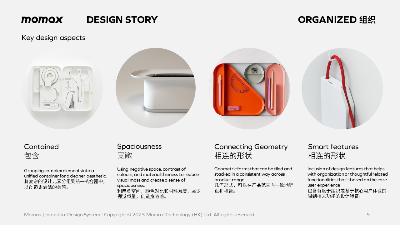
The new Momax design system with flexible system of core characters that can be interpreted in a multitude of ways while maintaining a strong shared core brand story across the board.
Go with the Flow
The first product line-up that was developed under the new philosophy was the Flow series, which was intended to be both a culmination of what Momax has accomplished to that point while bringing a fresh forward-looking approach onto the table with the more flexible yet identifiable philosophy at its heart.
Drawing inspiration from Bruce Lee’s famous quote “Be water”. The design language is a literal interpretation of water with a flowing transparent surface juxtaposed on a calm-minimalist Apple-inspired “container” form that resulted in a lineup that maintained a strong sense of calmness, simplicity, and cleanliness while letting the product express the sense of internal quality outwardly with confidence through the transparent window.
First batch of Flow series product lineup.
How each brand core characteristics were interpret and combined to gives Flow series its unique characteristics.
X mark the generation
Another series was conceived under the new design methodology. With the aim to broaden the appeal towards the younger generation, we employed a rougher but vibrant side of Hong Kong’s architectural and infrastructural visual elements to create a more straightforward brutalist approach to product design made to appeal to a more progressive-minded generation of consumers.
X Series employs a more brutalist approach to design taking inspirations from Hong Kong’s practically built architectures and public infrastructure.


